I'm working in this font =)

3172 views 12 replies
Reply to Topic
raphaelroxter

Age: 44
Total Posts: 171
Points: 0

Location:
São Paulo, Brazil
Topic on Oct 15, 2012 03:58 AM
Hello everybody I am developing this new font family and would like some opinions'm preparing two pounds for her and another family with borders and dingbats. Comments are welcome. Thank you.


audiopimp says
Reply on Oct 15, 2012 04:53 AM
Very flavour of the month, it looks great. I really like M,W,E,F.
It's the sort of font you see on www.tendollarfonts.com

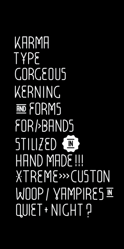
However, I think the Z looks unbalanced, and the S looks too much like a 5.
The O looks a little too narrow, compared to the C, which looks too wide.
The O,C,G,Q should be similar, shouldn't they?


Reply on Oct 15, 2012 04:58 AM
Thanks for the tips, I'll look for a more appropriate alignment of these ideas help a lot to improve the design of a kind. Thank you =)

audiopimp says
Reply on Oct 15, 2012 05:05 AM
You could have 2 different versions, a thin C,D,G,O,Q and one with a wider set.

Reply on Oct 15, 2012 05:09 AM
Yes, I thought about it and I intend to work glyphs and variations to the same source, and weights, in fact I would like to know if anyone knows of any program easier to use than the laboratory source, found it very difficult. I know it does corel draw, but this program hehe hate preferred design in Adobe Illustrator and import it into a program where I could create the font kerning and traking. =)

audiopimp says
Reply on Oct 15, 2012 05:12 AM
I use Illustrator CS and Fontlab Studio5.
For kerning I send my fonts to www.ikern.com otherwise it takes me too long to do.

Reply on Oct 15, 2012 05:14 AM
cool ikern.com not know =) thanks

Pixiel says
Reply on Oct 15, 2012 06:13 AM
What kind of comments you want?... love it!...are you going to share it with us? :)
Reminds me this other http://www.fonts101.com/c/forum/topic/10147/Font_o_Talk/In_The_Loop
I couldn't get :(


Reply on Oct 15, 2012 06:17 AM
You can do what you want to comment. Even if it is not, my pretension is to improve as much as possible this font and sells it. Sorry. But I intend to do a beta so they can test part of the source =)

Pixiel says
Reply on Oct 15, 2012 08:35 AM
Ok, I can wait until 101 released :D

Fontattack says
Reply on Oct 16, 2012 01:10 AM
I like this. It clean and easy to read. My favorite letter is the V.

The S does look like a 5, as Audiopimp pointed out.

There is something about the G that is throwing me off. Maybe it's the length of the arm being a hair too short.


Reply on Oct 16, 2012 02:02 AM
I understand well percepido, with time she'll let perfect =) Thanks.

mv118 says
Reply on Oct 16, 2012 02:21 AM
Impressive!

xdnancy says
Reply on Oct 17, 2012 03:39 AM
it looks amazing! tell me when it outs

Reply to Topic

Font'O'Day List

Please enter your email address receive a free font daily from Fonts101.com in your Email!