Reply on Dec 10, 2012 03:06 AM
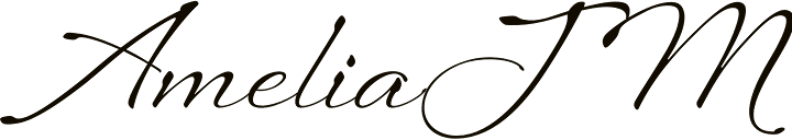
Now you describe where it was used I'm 100% positive, it is NOT a font.
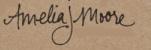
In 1992 I designed a series of business cards for a client, and used everyone's actual signature as part of the design.
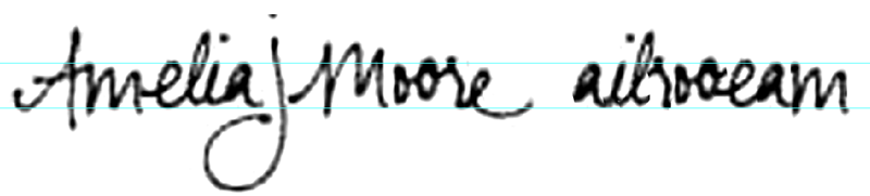
I've also done a breakdown for you. As you can see it is inconsistent, and in my opinion it would be very difficult to make a actual font to conform to it's uniqueness.
The 'm' flows perfectly from the crossbar of A. This is very unusual, and an attention to detail rarely scene in typography. The r to e is also very suspect. Also the other letters if swapped around would not flow together.
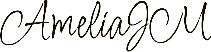
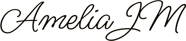
These are the closest I could find.Shelby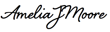
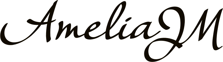
Sweetheart Script