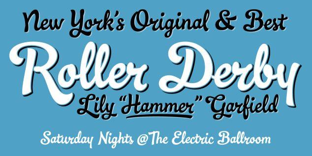
I swear it seems like a race on who can put out the most new fonts with many of them very similar.
Here is another one, very very nice but doesn't really standout as anything different or unique. (other than the high # of glyphs)

http://www.myfonts.com/fonts/schizotype/ollie/
I'd prefer them to slow down a little and add some uniqueness or variants to make it something special and stand out.
Just the voices in my head flowing to my keyboard, but what do you all think, is the font market becoming too saturated?
Mark
For a min. I thought it was my eyes going crossed-eyed X|
I thought I look at fonts so much they are starting to look alike to me...BUT NO IT'S NOT ME! It's the lack of imagination, it's like a race for time rather than a race for real showmanship :(
And yes, I think so... "FONTAHOLICS" :S
:)
1. Economic recession and the need to try and make a living.
2. Font theft, with fonts being shared the income dwindles as more and more can just google for a free copy.
3. Demand for more features, international characters, contextual/discretionary alternates/ligatures etc (i.e. "Pro" versions).
4. Good old sales pitch, creation of demand, everyone must have the latest etc.
5. Inter-foundry rivalry. Consider the number of Sans or Slab-Serifs that look virtually the same.
Some of the sales pitch goes to ridiculous lengths e.g. number of kerning pairs. (For example Dulcinea by Re-type has 107,681 kerning pairs - unbelievable!).
All these are typical of a capitalist market. At least we have loads of choice!