audiopimp

Age: 124
4908 days old here
Total Posts: 357
Points: 0

Location:
Earth, United Kingdom
I've never seen refrigerator before.
You're not likely to find it for FREE, but there are plenty of similar fonts.
Posted 22 Oct 2012

audiopimp

Age: 124
4908 days old here
Total Posts: 357
Points: 0

Location:
Earth, United Kingdom
Posted 21 Oct 2012

Topic:

audiopimp

Age: 124
4908 days old here
Total Posts: 357
Points: 0

Location:
Earth, United Kingdom
I'm a big fan of Sam Cooke's versions. Both the slow and uptempo versions.
Posted 20 Oct 2012

Topic:

audiopimp

Age: 124
4908 days old here
Total Posts: 357
Points: 0

Location:
Earth, United Kingdom
They're quite old. I'm sure you'll be able to pick them up for peanuts.
Posted 19 Oct 2012

audiopimp

Age: 124
4908 days old here
Total Posts: 357
Points: 0

Location:
Earth, United Kingdom
No they don't, all letters are in the version I have already linked!


Posted 19 Oct 2012

audiopimp

Age: 124
4908 days old here
Total Posts: 357
Points: 0

Location:
Earth, United Kingdom
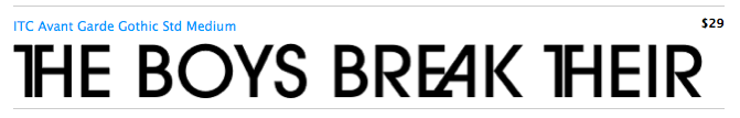
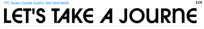
It's the same font, except some of the extended lines are modified to fit in with the design of the video.
All characters are in Avant Garde, they are just hidden within the OT Features.

Click the ff button in MyFonts to see the variations.


Posted 19 Oct 2012

audiopimp

Age: 124
4908 days old here
Total Posts: 357
Points: 0

Location:
Earth, United Kingdom
Posted 19 Oct 2012

Topic: FF Chartwell

audiopimp

Age: 124
4908 days old here
Total Posts: 357
Points: 0

Location:
Earth, United Kingdom
I don't understand !
Posted 18 Oct 2012

Topic: NT Novo Enno

audiopimp

Age: 124
4908 days old here
Total Posts: 357
Points: 0

Location:
Earth, United Kingdom
Posted 18 Oct 2012

audiopimp

Age: 124
4908 days old here
Total Posts: 357
Points: 0

Location:
Earth, United Kingdom
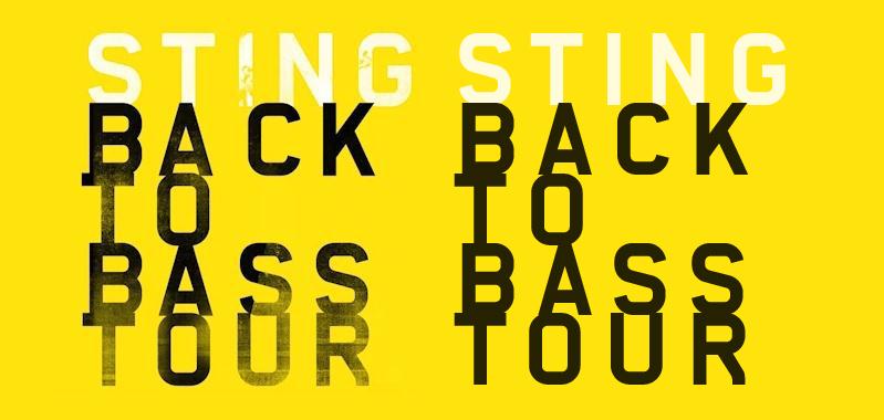
I now agree. Well spotted.
I was looking at Alpha Headline Pro which is slightly different.
It is actually just plain old Alpha Headline, the Pro version has a proper lower case, where as Alpha Headline has capitals throughout, with the lowercase having slightly modified characters.
The STING BACK TO BASS TOUR is all lowercase except the R which is uppercase.


Posted 17 Oct 2012

audiopimp

Age: 124
4908 days old here
Total Posts: 357
Points: 0

Location:
Earth, United Kingdom
I don't think it is Alpha Headline, although it is very very similar.
Nearly every character is slightly different.
It's definitely something else. If anything Alpha Headline is based on the 'sting' font.
Posted 16 Oct 2012

audiopimp

Age: 124
4908 days old here
Total Posts: 357
Points: 0

Location:
Earth, United Kingdom
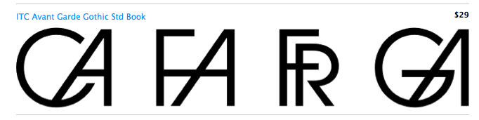
A couple of very nice, and newly released (10 days ago) fonts, and both on sale.
Posted 16 Oct 2012

Topic:

audiopimp

Age: 124
4908 days old here
Total Posts: 357
Points: 0

Location:
Earth, United Kingdom
Font beauty is definitely in the eye of the beholder.
This font is badly balanced. The kerning is really very poor. The space between is far too wide. It looks really amateurish. Sorry, but it's not the sort of thing I'd ever keep in my files.
Posted 16 Oct 2012

audiopimp

Age: 124
4908 days old here
Total Posts: 357
Points: 0

Location:
Earth, United Kingdom
At $229 for the complete family of 18 styles is good value at only $12.72 per weight.
If you are thinking of using it commercially for a client, I would get the client to buy it.
Otherwise there are a few similar fonts.


Posted 16 Oct 2012

audiopimp

Age: 124
4908 days old here
Total Posts: 357
Points: 0

Location:
Earth, United Kingdom
Have you got the 7 weights of YWFT Service, that's pretty similar.


Posted 15 Oct 2012

audiopimp

Age: 124
4908 days old here
Total Posts: 357
Points: 0

Location:
Earth, United Kingdom
Jan 2013 - Sorry everyone, but I no longer use this site due to the abusive and aggressive actions of MV118 (Michelle Vargas-Delgado).
It is her actions, and her actions alone that have caused the sad demise of this forum.
Her power mad ways, stomping around like a little girl, deleting, closing and rewriting posts to suit her own selfish needs.
Her manipulation of the facts could not be tolerated any more.
I have screen captures of all the abuse, and negativity she has rained down like a black veil upon this forum.

Now I am totally bored of her inconsistent and erratic behaviour, and I know so many of you feel the same.

Take care.

Posted 15 Oct 2012

audiopimp

Age: 124
4908 days old here
Total Posts: 357
Points: 0

Location:
Earth, United Kingdom
I use Illustrator CS and Fontlab Studio5.
For kerning I send my fonts to www.ikern.com otherwise it takes me too long to do.
Posted 15 Oct 2012

audiopimp

Age: 124
4908 days old here
Total Posts: 357
Points: 0

Location:
Earth, United Kingdom
You could have 2 different versions, a thin C,D,G,O,Q and one with a wider set.
Posted 15 Oct 2012

audiopimp

Age: 124
4908 days old here
Total Posts: 357
Points: 0

Location:
Earth, United Kingdom
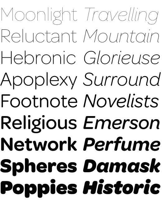
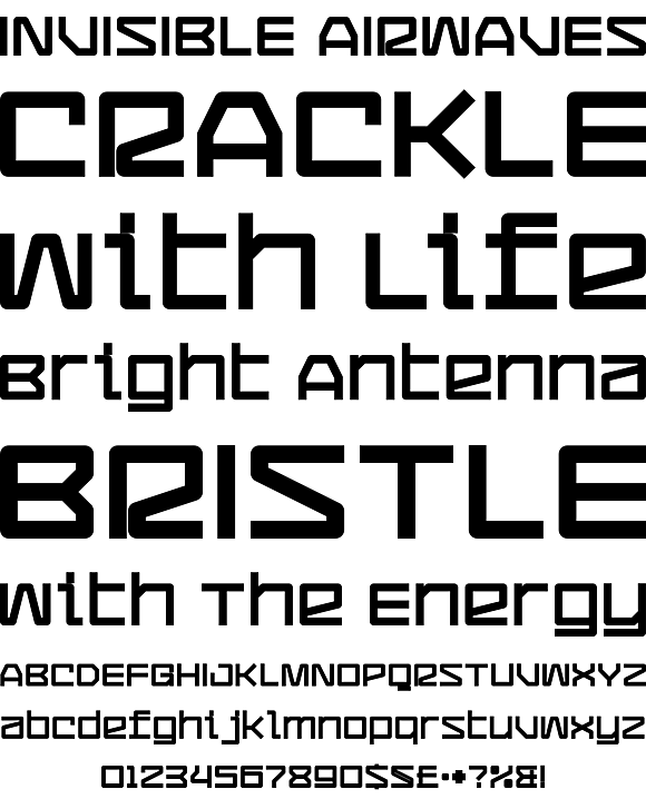
Very flavour of the month, it looks great. I really like M,W,E,F.
It's the sort of font you see on www.tendollarfonts.com

However, I think the Z looks unbalanced, and the S looks too much like a 5.
The O looks a little too narrow, compared to the C, which looks too wide.
The O,C,G,Q should be similar, shouldn't they?

Posted 15 Oct 2012

audiopimp

Age: 124
4908 days old here
Total Posts: 357
Points: 0

Location:
Earth, United Kingdom
The S & N's are both slightly different.
Posted 14 Oct 2012

audiopimp

Age: 124
4908 days old here
Total Posts: 357
Points: 0

Location:
Earth, United Kingdom
It looks very fanciful & ultra ornate.
It's something I could never see me using.
Posted 14 Oct 2012

audiopimp

Age: 124
4908 days old here
Total Posts: 357
Points: 0

Location:
Earth, United Kingdom
I would say any format of alphabetical characters could be considered a font.
As there are also some Photoshop layered fonts.
Posted 14 Oct 2012

audiopimp

Age: 124
4908 days old here
Total Posts: 357
Points: 0

Location:
Earth, United Kingdom
Some very nice freebies, although as all things, if you use them commercially, you need to contact the designer for permission.
Posted 13 Oct 2012

audiopimp

Age: 124
4908 days old here
Total Posts: 357
Points: 0

Location:
Earth, United Kingdom
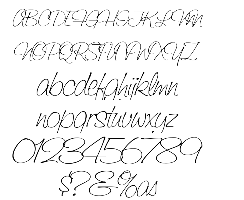
It's not a font.
It's hand rendered as none of the repeated characters are the same.
For instance there are three different 'y's, two different 'm's and two different 'o's.
Posted 13 Oct 2012

audiopimp

Age: 124
4908 days old here
Total Posts: 357
Points: 0

Location:
Earth, United Kingdom
As you know Mercury Script, was only released 6 days ago.
It's on sale for $69.30 for 3 weight & 3 ornaments.

There are a few similar to it:-
FREE
Honey Script Light
Rouge Script

NOT FREE
Aya Script
Filmotype Jessy
Sweetheart Script


Posted 12 Oct 2012

Topic: Great Buy

audiopimp

Age: 124
4908 days old here
Total Posts: 357
Points: 0

Location:
Earth, United Kingdom
I've just bought it. For $9 you can't go wrong.
Posted 12 Oct 2012

audiopimp

Age: 124
4908 days old here
Total Posts: 357
Points: 0

Location:
Earth, United Kingdom
I agree with Lowercase it is definitely hand-drawn. No two of the same letters match.
Posted 12 Oct 2012

Topic: Tikal

audiopimp

Age: 124
4908 days old here
Total Posts: 357
Points: 0

Location:
Earth, United Kingdom
A very nice display font.
They should have used a different name though as there is already a much bigger font called Tikal out there.
Posted 11 Oct 2012

audiopimp

Age: 124
4908 days old here
Total Posts: 357
Points: 0

Location:
Earth, United Kingdom
That's hot, but I'm not really looking at the font.
Posted 11 Oct 2012

Topic: Mass Sign-off

audiopimp

Age: 124
4908 days old here
Total Posts: 357
Points: 0

Location:
Earth, United Kingdom
He doesn't read every post.
If you go to If you go to this link http://www.fonts101.com/c/forum/topic/10084/Help__Support/YOU_MUST_READ_THESE_RULES_BEFORE_POSTING
and click on his name 'jag' in the top left, then send him a personal message.
Posted 10 Oct 2012

Font'O'Day List

Please enter your email address receive a free font daily from Fonts101.com in your Email!