audiopimp

Age: 124
4908 days old here
Total Posts: 357
Points: 0

Location:
Earth, United Kingdom
Happy to help.
Posted 13 Dec 2012

audiopimp

Age: 124
4908 days old here
Total Posts: 357
Points: 0

Location:
Earth, United Kingdom
I know, but it copies and pastes ok. Smiles and all.
No news on Flowertype.
Posted 13 Dec 2012

audiopimp

Age: 124
4908 days old here
Total Posts: 357
Points: 0

Location:
Earth, United Kingdom
I also did a search in google for leaf font.
Free Mosaic Leaf download.

Copy and paste these, t won't let me hot link.
http://www.google.co.uk/search?q=leaves+font&hl=en&safe=off&client=firefox-a&hs=p3p&tbo=u&rls=org.mozilla:en-US:official&channel=s&tbm=isch&source=univ&sa=X&ei=DKrIUPXSPIy20QWelIDIBA&ved=0CEUQsAQ&biw=1394&bih=743

http://www.google.co.uk/search?q=leaves+font&hl=en&safe=off&client=firefox-a&hs=p3p&tbo=u&rls=org.mozilla:en-US:official&channel=s&tbm=isch&source=univ&sa=X&ei=DKrIUPXSPIy20QWelIDIBA&ved=0CEUQsAQ&biw=1394&bih=743#hl=en&safe=off&client=firefox-a&tbo=d&rls=org.mozilla:en-US:official&channel=s&tbm=isch&spell=1&q=leaf+font&sa=X&ei=mqzIUJCYCcaR0QWFpoCABg&ved=0CE4QBSgA&bav=on.2,or.r_gc.r_pw.r_qf.&bvm=bv.1354675689,d.d2k&fp=161e65b307e37aa4&bpcl=39650382&biw=1282&bih=745

Posted 12 Dec 2012

audiopimp

Age: 124
4908 days old here
Total Posts: 357
Points: 0

Location:
Earth, United Kingdom
I found these in my files:-


Posted 12 Dec 2012

audiopimp

Age: 124
4908 days old here
Total Posts: 357
Points: 0

Location:
Earth, United Kingdom
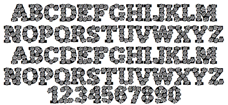
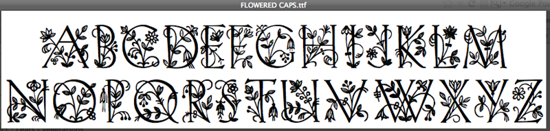
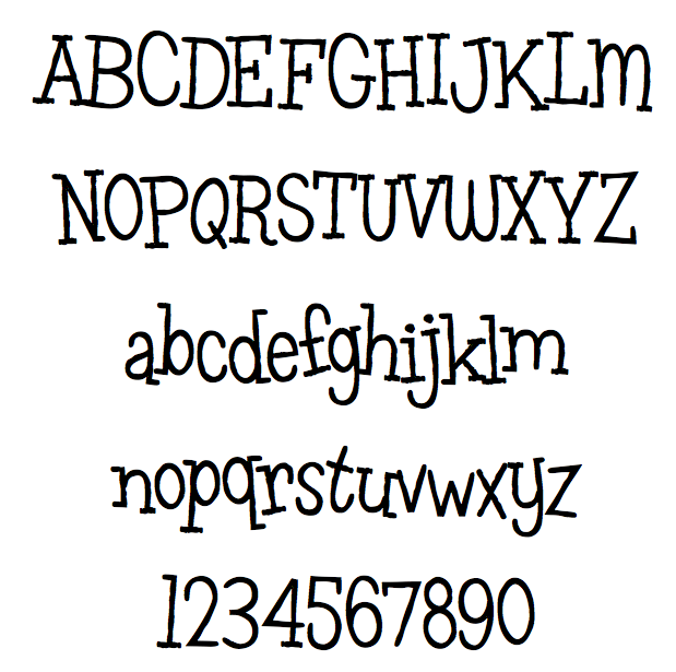
Flowertype is very nice. I've never seen it before.

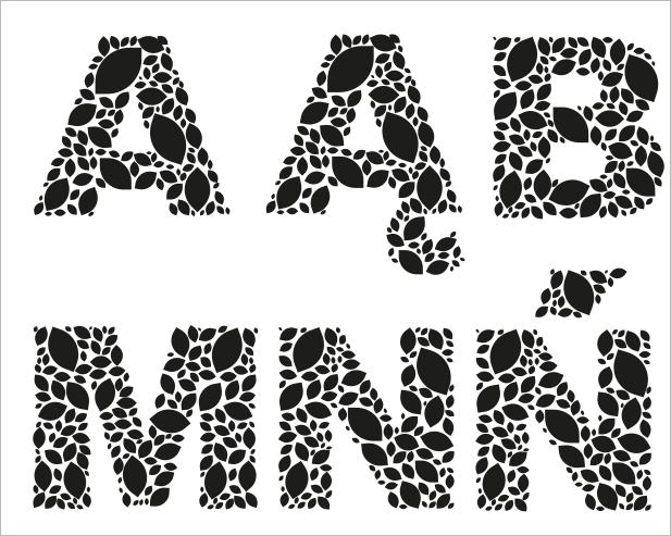
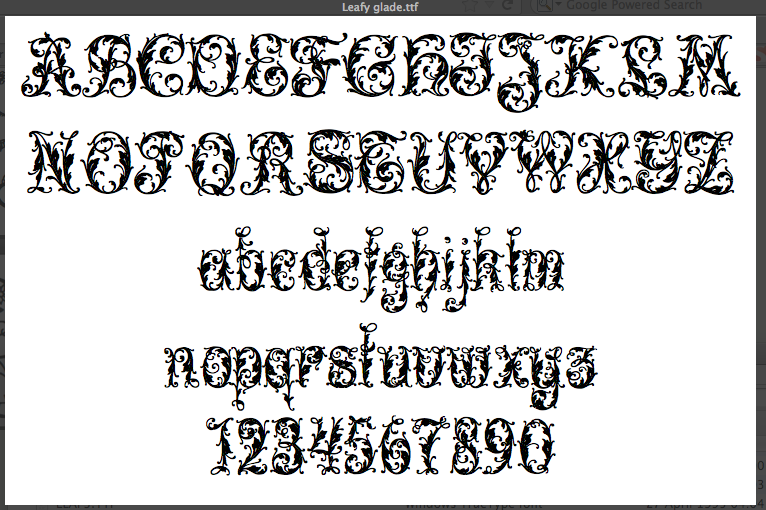
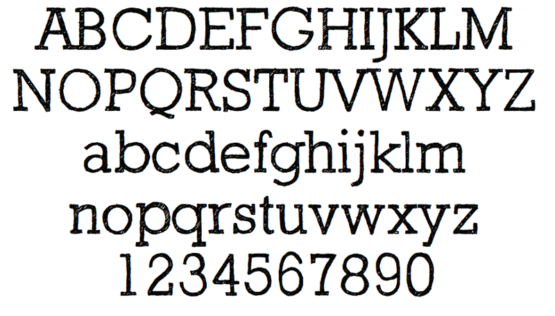
I can't help with the leaves/ foliage one.
If you can't find a link or jpg to an actual font rather than just a description, then I'm not sure anyone can help.

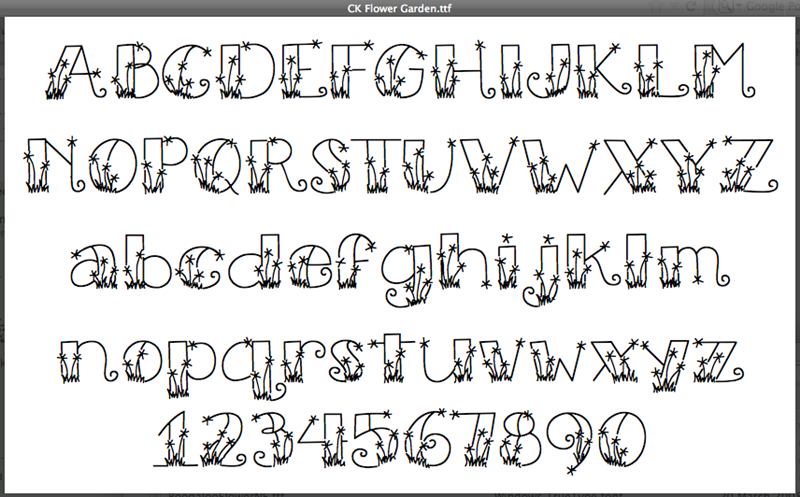
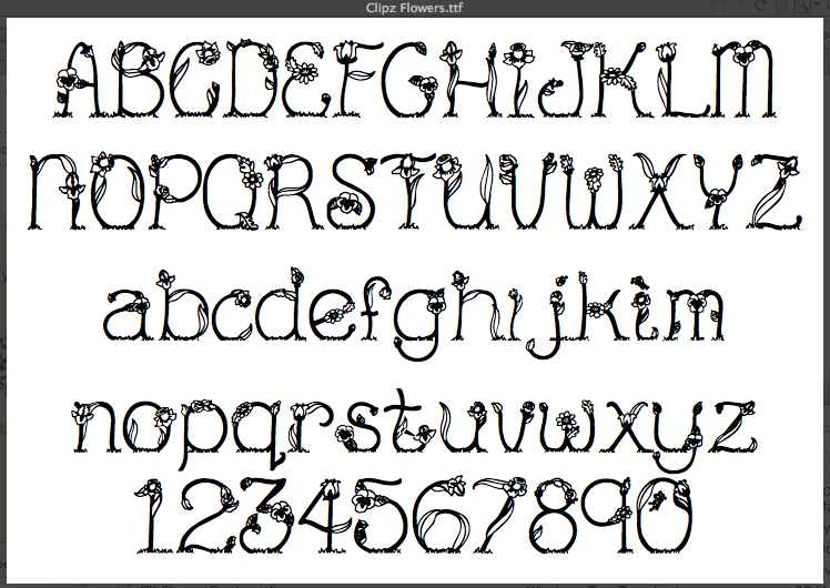
Other similar flower fonts but still not as good as Flowertype.


Posted 12 Dec 2012

audiopimp

Age: 124
4908 days old here
Total Posts: 357
Points: 0

Location:
Earth, United Kingdom
@Marlisa. I think you'll find it's 100% Anodyne Combined. The marks change if you use lowercase or standard ligatures.


Note the change in the OO ligature.

Posted 12 Dec 2012

Topic: Foliage

audiopimp

Age: 124
4908 days old here
Total Posts: 357
Points: 0

Location:
Earth, United Kingdom
No problem.
Posted 12 Dec 2012

Topic: Foliage

audiopimp

Age: 124
4908 days old here
Total Posts: 357
Points: 0

Location:
Earth, United Kingdom
Look for Leaves vector silhouette

http://vector4free.com/vectors/id/252

Posted 12 Dec 2012

audiopimp

Age: 124
4908 days old here
Total Posts: 357
Points: 0

Location:
Earth, United Kingdom
Just found out I only have three weights !! :(
Posted 12 Dec 2012

audiopimp

Age: 124
4908 days old here
Total Posts: 357
Points: 0

Location:
Earth, United Kingdom
I'm pretty sure it's Anodyne Combined.

Others similar.

Posted 12 Dec 2012

audiopimp

Age: 124
4908 days old here
Total Posts: 357
Points: 0

Location:
Earth, United Kingdom
I've not seen anything like it, sorry.
Posted 12 Dec 2012

audiopimp

Age: 124
4908 days old here
Total Posts: 357
Points: 0

Location:
Earth, United Kingdom
Who designed it?
Posted 12 Dec 2012

Topic: Foliage

audiopimp

Age: 124
4908 days old here
Total Posts: 357
Points: 0

Location:
Earth, United Kingdom
You would have more luck doing a search for 'leaves vector'.
Posted 12 Dec 2012

audiopimp

Age: 124
4908 days old here
Total Posts: 357
Points: 0

Location:
Earth, United Kingdom
I have it, it has a nice variation of weights. I particularly like the lower case t.
Posted 12 Dec 2012

audiopimp

Age: 124
4908 days old here
Total Posts: 357
Points: 0

Location:
Earth, United Kingdom
If you're looking for something similar as Pixiel.
I PM'd them last week, with a big list of similar free ones.
Posted 11 Dec 2012

audiopimp

Age: 124
4908 days old here
Total Posts: 357
Points: 0

Location:
Earth, United Kingdom
I managed to pick them up last month, but I've never seen 3 before.
Posted 11 Dec 2012

audiopimp

Age: 124
4908 days old here
Total Posts: 357
Points: 0

Location:
Earth, United Kingdom
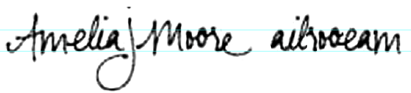
Even when you take into consideration the screen printing, fabric stretch and body curvature issue that is causing it to look distorted and different.
The repeated E & R letters don't match.
It is most likely hand-drawn.

Closest other option I can find is:-
Leftovers

Sketchbook

Posted 11 Dec 2012

audiopimp

Age: 124
4908 days old here
Total Posts: 357
Points: 0

Location:
Earth, United Kingdom
Beauty is in the eye of the beholder.
You could start with this lot.
Brush Fonts at MyFonts
Posted 11 Dec 2012

Topic: Tee Franklin

audiopimp

Age: 124
4908 days old here
Total Posts: 357
Points: 0

Location:
Earth, United Kingdom
If you really want others to help, a jpg and a hot link always gets better results.
Posted 10 Dec 2012

Topic: ???

audiopimp

Age: 124
4908 days old here
Total Posts: 357
Points: 0

Location:
Earth, United Kingdom
Jan 2013 - Sorry everyone, but I no longer use this site due to the abusive and aggressive actions of MV118 (Michelle Vargas-Delgado).
Posted 10 Dec 2012

Topic: Dala Floda

audiopimp

Age: 124
4908 days old here
Total Posts: 357
Points: 0

Location:
Earth, United Kingdom
A jpg and a link might be nice, don't you think ?
Posted 10 Dec 2012

audiopimp

Age: 124
4908 days old here
Total Posts: 357
Points: 0

Location:
Earth, United Kingdom
I thought I'd seen it before.
It's very similar to Whirled Peas NF (Nick's Fonts) designed in 2005.


Posted 10 Dec 2012

audiopimp

Age: 124
4908 days old here
Total Posts: 357
Points: 0

Location:
Earth, United Kingdom
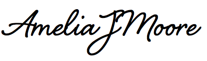
Now you describe where it was used I'm 100% positive, it is NOT a font.
In 1992 I designed a series of business cards for a client, and used everyone's actual signature as part of the design.
I've also done a breakdown for you. As you can see it is inconsistent, and in my opinion it would be very difficult to make a actual font to conform to it's uniqueness.
The 'm' flows perfectly from the crossbar of A. This is very unusual, and an attention to detail rarely scene in typography. The r to e is also very suspect. Also the other letters if swapped around would not flow together.


These are the closest I could find.

Shelby

Sweetheart Script

Posted 10 Dec 2012

audiopimp

Age: 124
4908 days old here
Total Posts: 357
Points: 0

Location:
Earth, United Kingdom
I wonder if there is anything similar ??
Posted 10 Dec 2012

audiopimp

Age: 124
4908 days old here
Total Posts: 357
Points: 0

Location:
Earth, United Kingdom
It doesn't look like a font to me, it's not on a consistent line and the J is far too deep.
I think it's a signature.
Do you have any more of it?
Posted 10 Dec 2012

audiopimp

Age: 124
4908 days old here
Total Posts: 357
Points: 0

Location:
Earth, United Kingdom
I like it.
Posted 09 Dec 2012

Topic: Kinglet

audiopimp

Age: 124
4908 days old here
Total Posts: 357
Points: 0

Location:
Earth, United Kingdom
It's nice. I haven't seen it or something similar before.
Posted 09 Dec 2012

audiopimp

Age: 124
4908 days old here
Total Posts: 357
Points: 0

Location:
Earth, United Kingdom
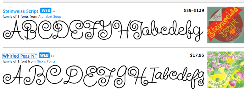
That's not right.
The regular would work better for smaller text as it has fatter tails & terminals, and the Display would be better for BIG SIZE DISPLAY work as it has thinner tails and terminals.
Hence why it is called Display.
Posted 08 Dec 2012

audiopimp

Age: 124
4908 days old here
Total Posts: 357
Points: 0

Location:
Earth, United Kingdom
They are very similar don't you think?
Posted 08 Dec 2012

audiopimp

Age: 124
4908 days old here
Total Posts: 357
Points: 0

Location:
Earth, United Kingdom
I've only seen Prensa. What's the difference with Prensa Display, besides it having condensed variations do you know?
Posted 08 Dec 2012

Font'O'Day List

Please enter your email address receive a free font daily from Fonts101.com in your Email!